Marlin Communications
Designing for purpose and participation
At Marlin Communications, I worked across a suite of charity and not-for-profit websites, each with its own distinct mission, audience, and communication needs. My role spanned the full UX process—from strategy through to interface design—with a focus on ensuring each site delivered real-world impact.
I began with Lean UX workshops to quickly align stakeholders around user needs and business goals, defining information architecture that made sense—both emotionally and functionally—for each audience.
Charity site patterns, page by page
From homepages to donation flows, how Xenome Studio approached each recurring page type across the Marlin Communications charity portfolio.
Homepages that build trust and drive action
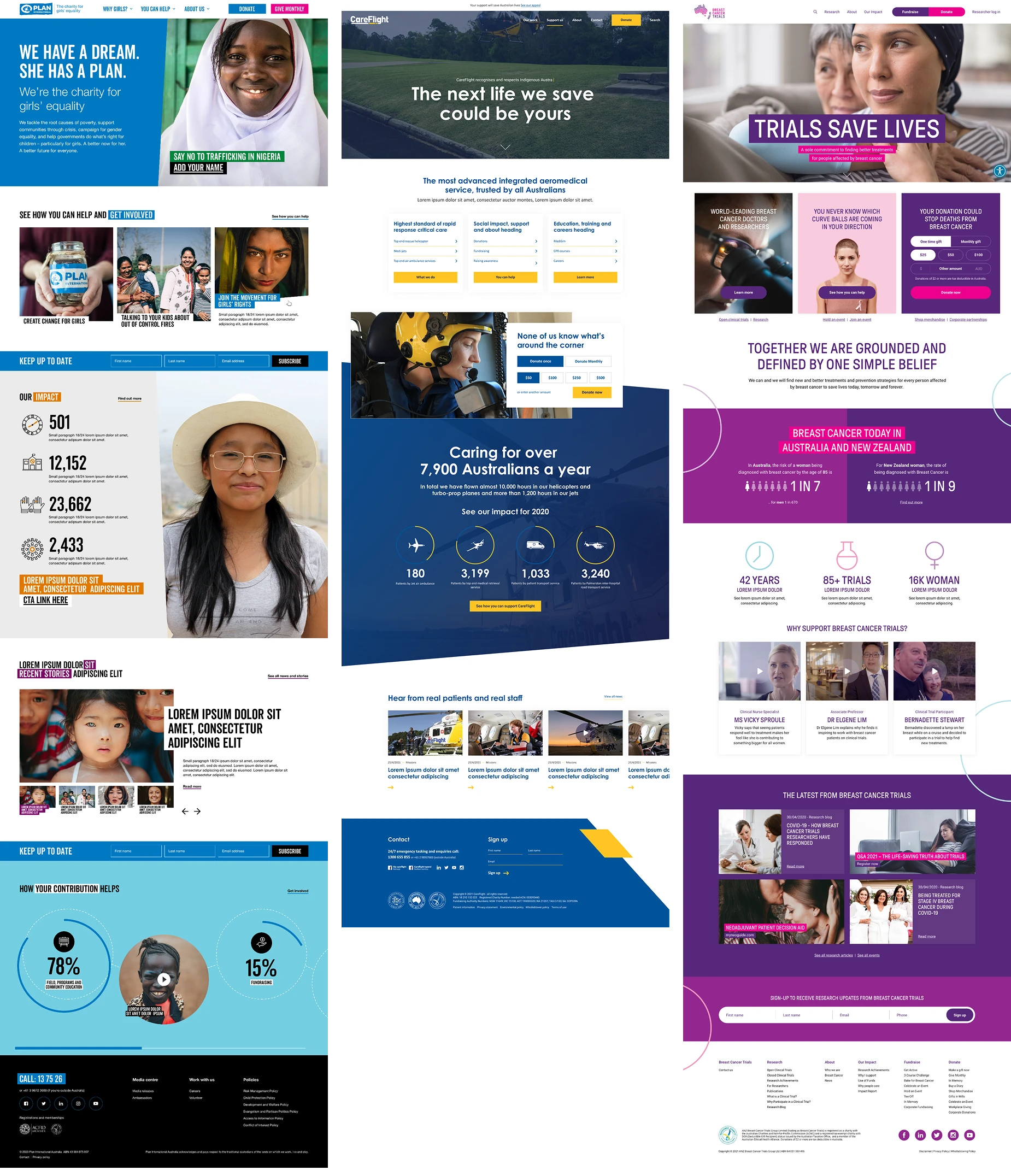
For organizations like Breast Cancer Trials, Plan International, CareFlight, Islamic Relief, Leukemia Foundation, and CHIA NSW, I designed homepages that clearly communicate who they are, what they do, and why it matters—right from the first scroll.
Each homepage guided users through a focused narrative:
- Mission clarity and key entry points
- Social proof through stats and stories
- Timely updates and actionable CTAs like donate or subscribe
Make the appeal the focus
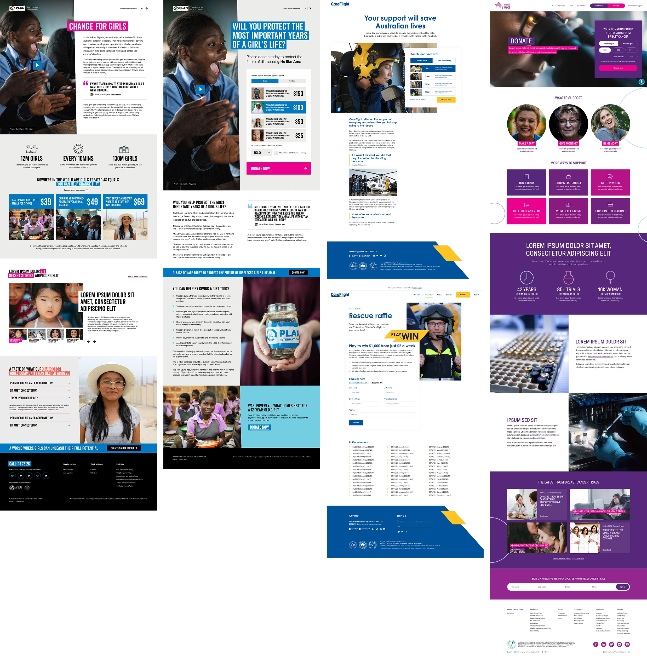
For campaign and appeal pages, I designed distraction-free experiences by removing global navigation and narrowing user focus to the core task—donation.
Each page featured a strong value proposition, persuasive storytelling, and dynamic donation modules with tiered pricing and smart upsells, layered with social proof and impact stats.
Make the next step clear
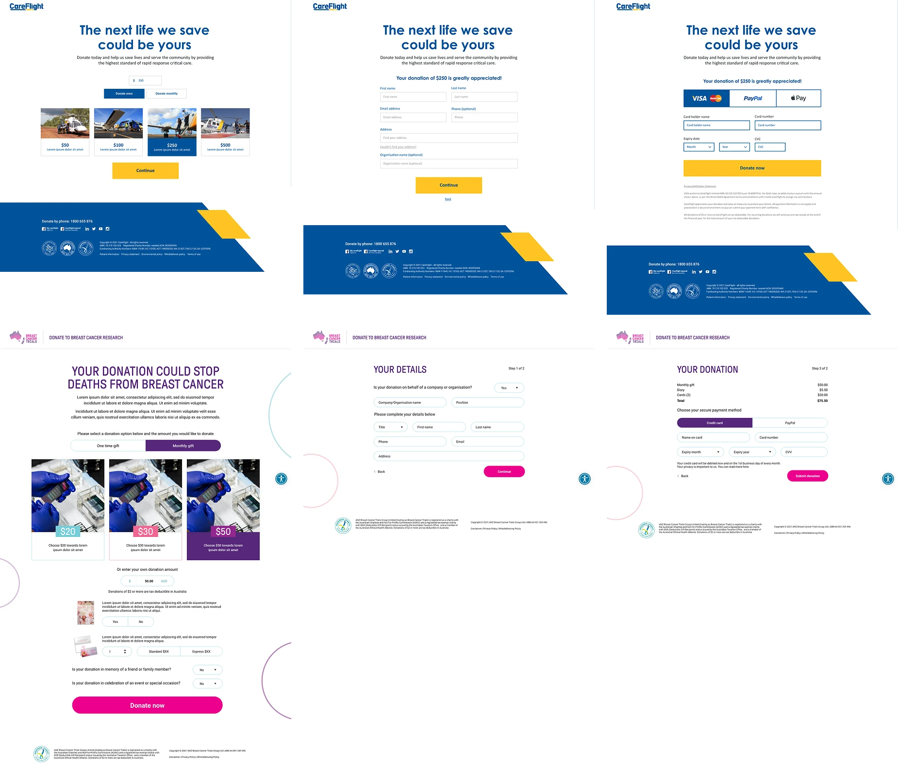
The goal was simple—keep users focused and remove friction. Wherever possible, we opted for distraction-free experiences by removing site navigation.
- Choose an amountOptionally dedicate the gift
- Enter personal detailsDonor information
- Confirm paymentComplete the donation
Guide people into the content
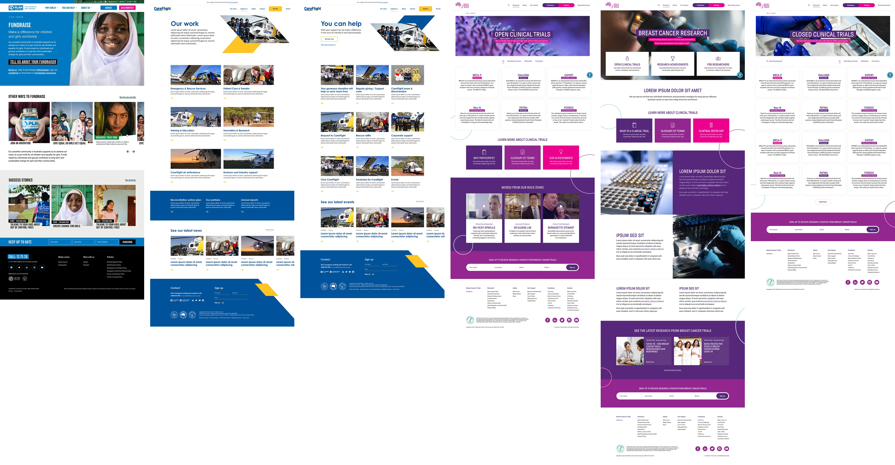
These pages acted as curated gateways, offering a concise overview of the section's purpose, supported by links to key sub-pages, with dynamic modules showcasing news, events, or updates.
Build flexibility into the page
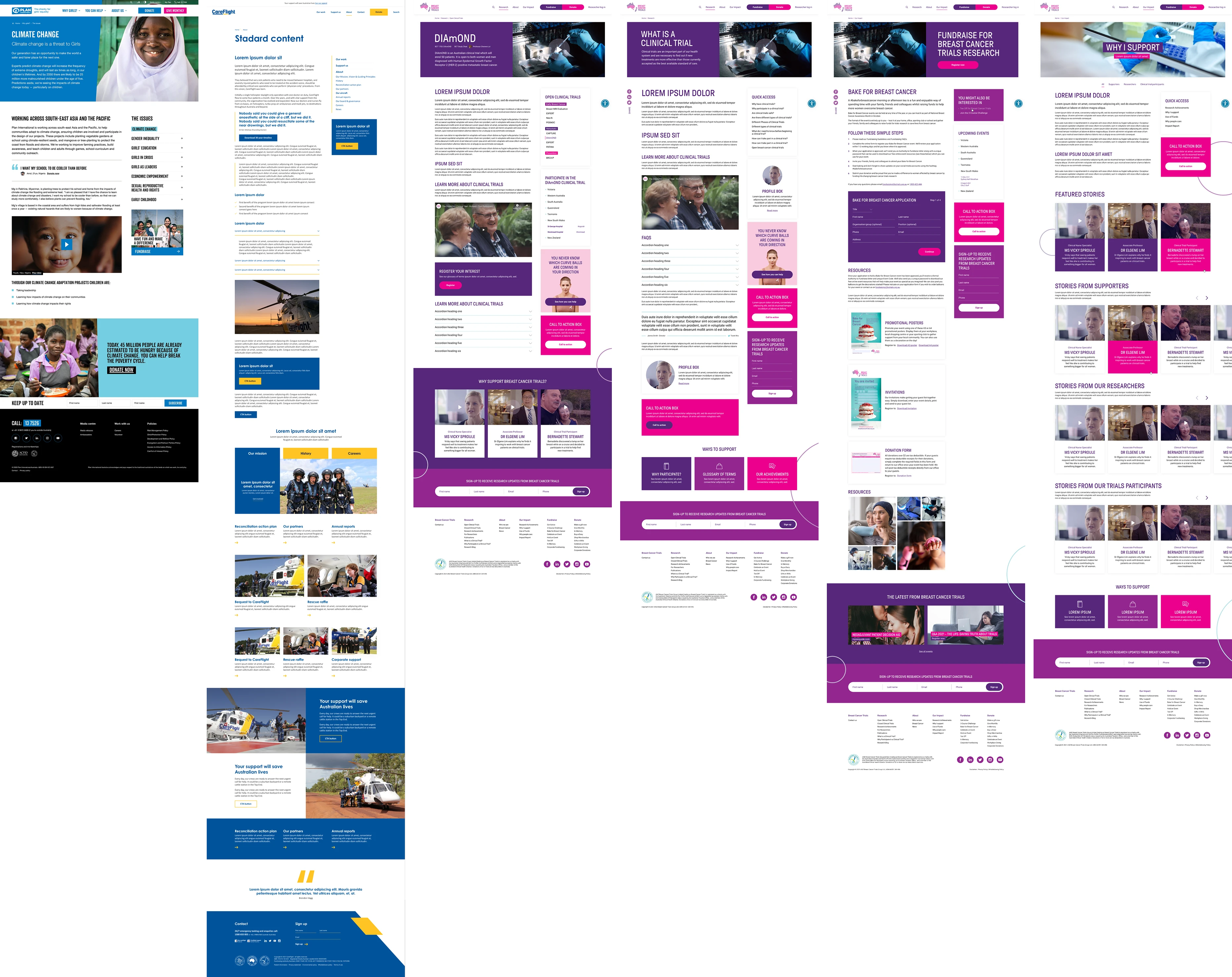
Each page began with a clear H1 and introductory blurb, followed by dynamic content blocks—videos, images, quotes, accordions, tabs, statistics, and feature highlights.
A right-hand sidebar often included contextual quick links and promotional callouts, built with accessibility standards and semantic structure top of mind.
Help readers find a useful story
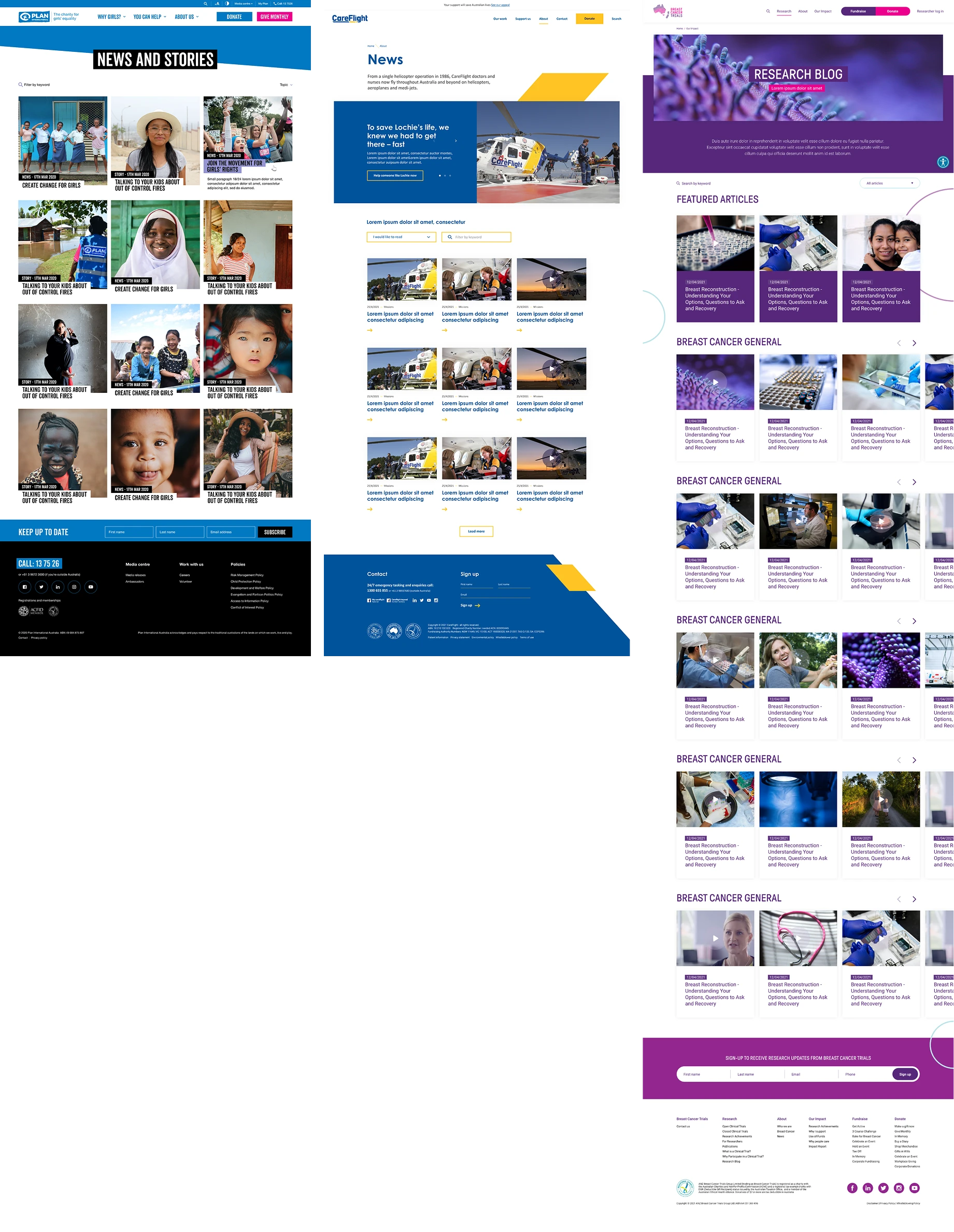
Each began with a brief introduction and a featured article to draw users in, followed by a searchable, taggable listing of updates—often segmented by topic or theme.
Make the story easy to read
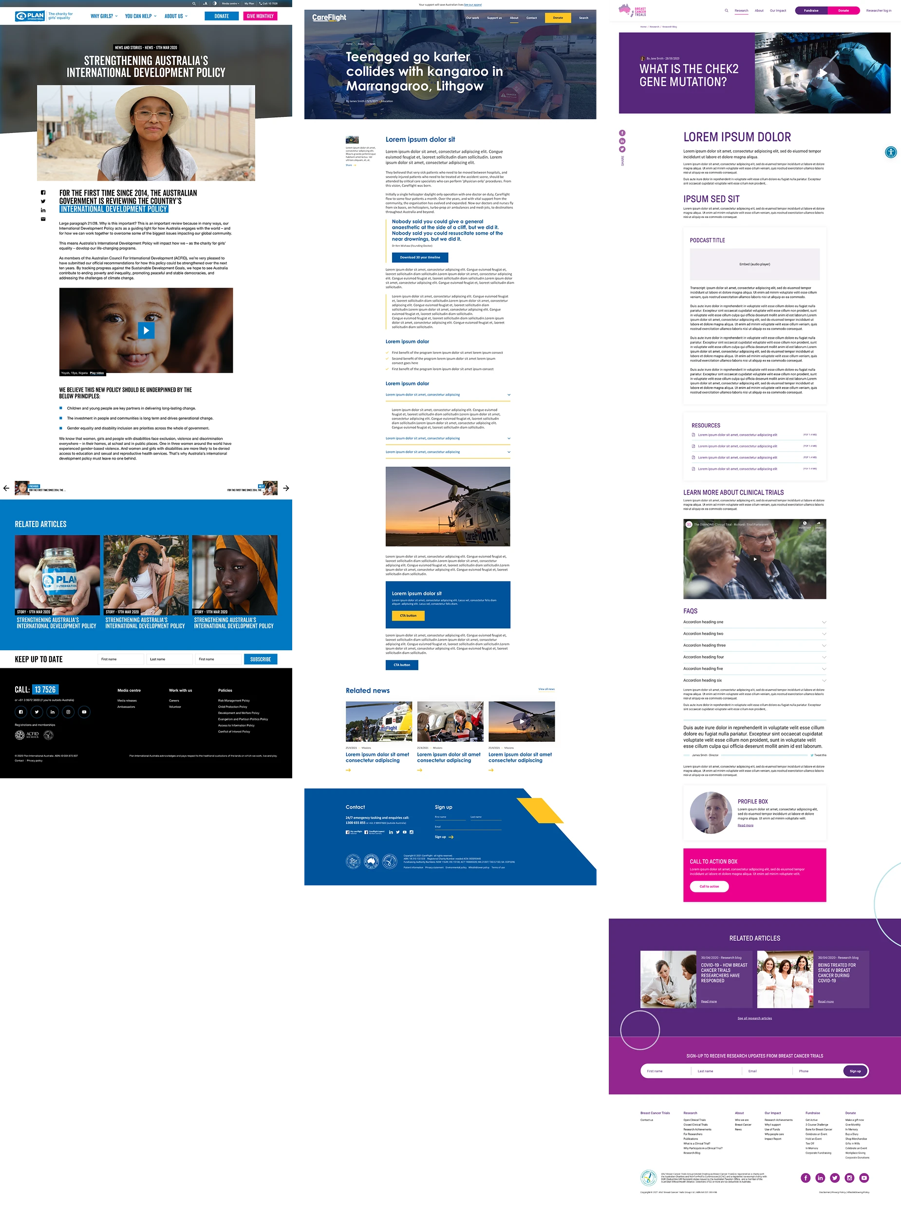
Each page supported styled callouts for quotes, FAQs, videos, and downloadable resources, alongside author attribution, related articles, and expandable read-more content.